Let me

Let me

get it

get it

ready!

ready!

Capstone: The Academy of Natural Science

Explore the interactive app designed to revolutionize museum experiences by seamlessly integrating digital technology with exhibits, fostering enhanced engagement and immersive interactions for all visitors.

Role

UX/UI Designer

Industry

Tourism Technology

Duration

5 months

a cell phone on a table

Stage 1. The Problem

Problem Statement: How might we personalize and enhance the museum visitor’s experience?

Meeting with Board of Museum: After an initial competitive analysis of local museums, we had a conversation with Marina McDougall, Vice President of Experience and Engagement at the Academy of Natural Sciences of Philadelphia. We discussed the possibilities of using AR and/or AI to enhance the visitor experience with a digital companion. One major potential problem discussed was whether encouraging visitors to use their phones at the museum would result in distraction and disengagement.

Stage 2. Research

Literature Review: One of the major takeaways from our literature review was that there are several generally agreed upon categories of museum visitors:

  • Explorers: curiosity-driven with general interest in the content of the museum

  • Facilitators: socially motivated and focused on enabling the experience and learning of others

  • Professional/Hobbyist: feel a close tie between the museum & their personal interests or passions

  • Experience Seekers: want to be able to say they were there; “been there, done that”

  • Rechargers: seek a contemplative or restorative experience

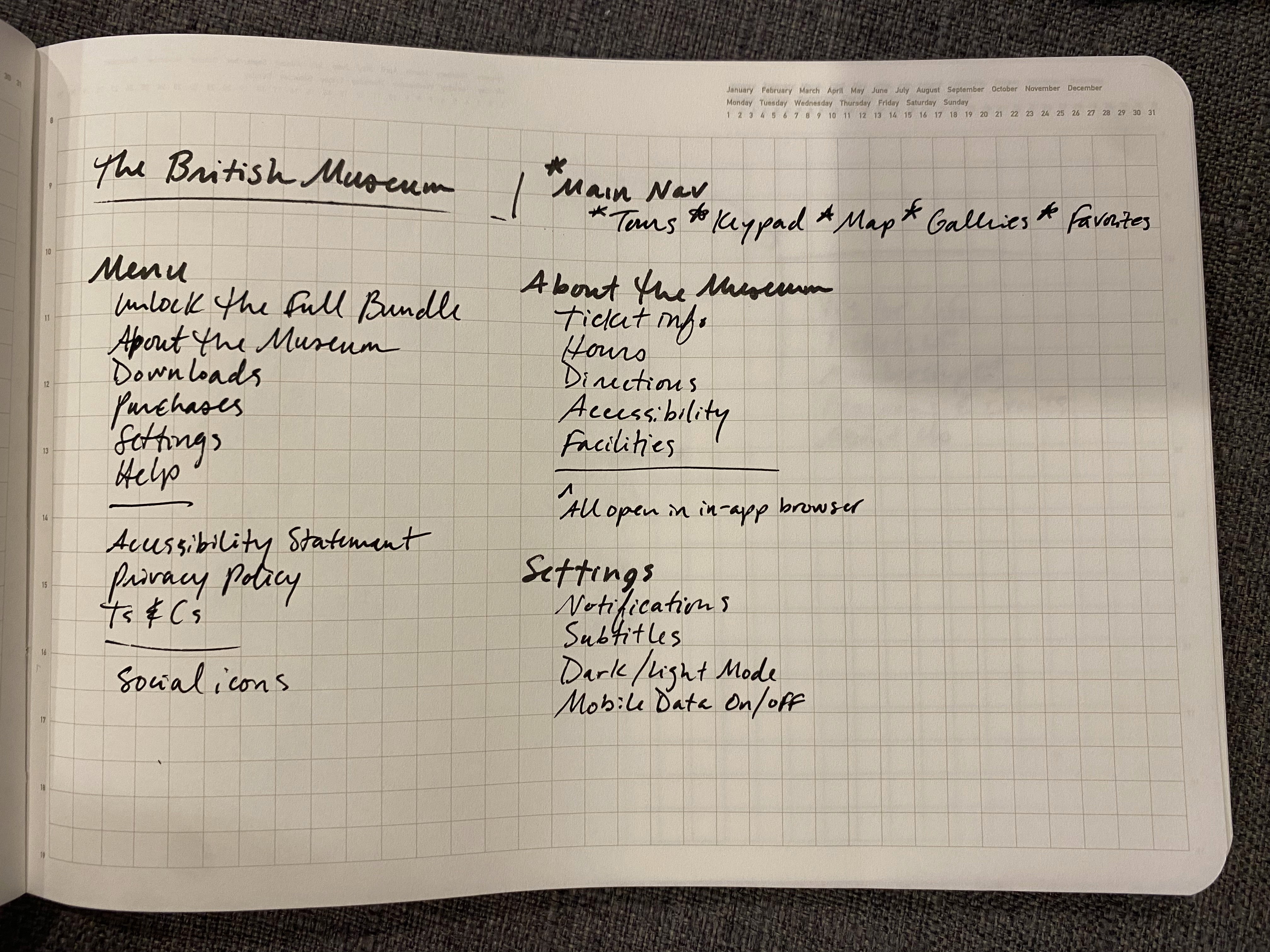
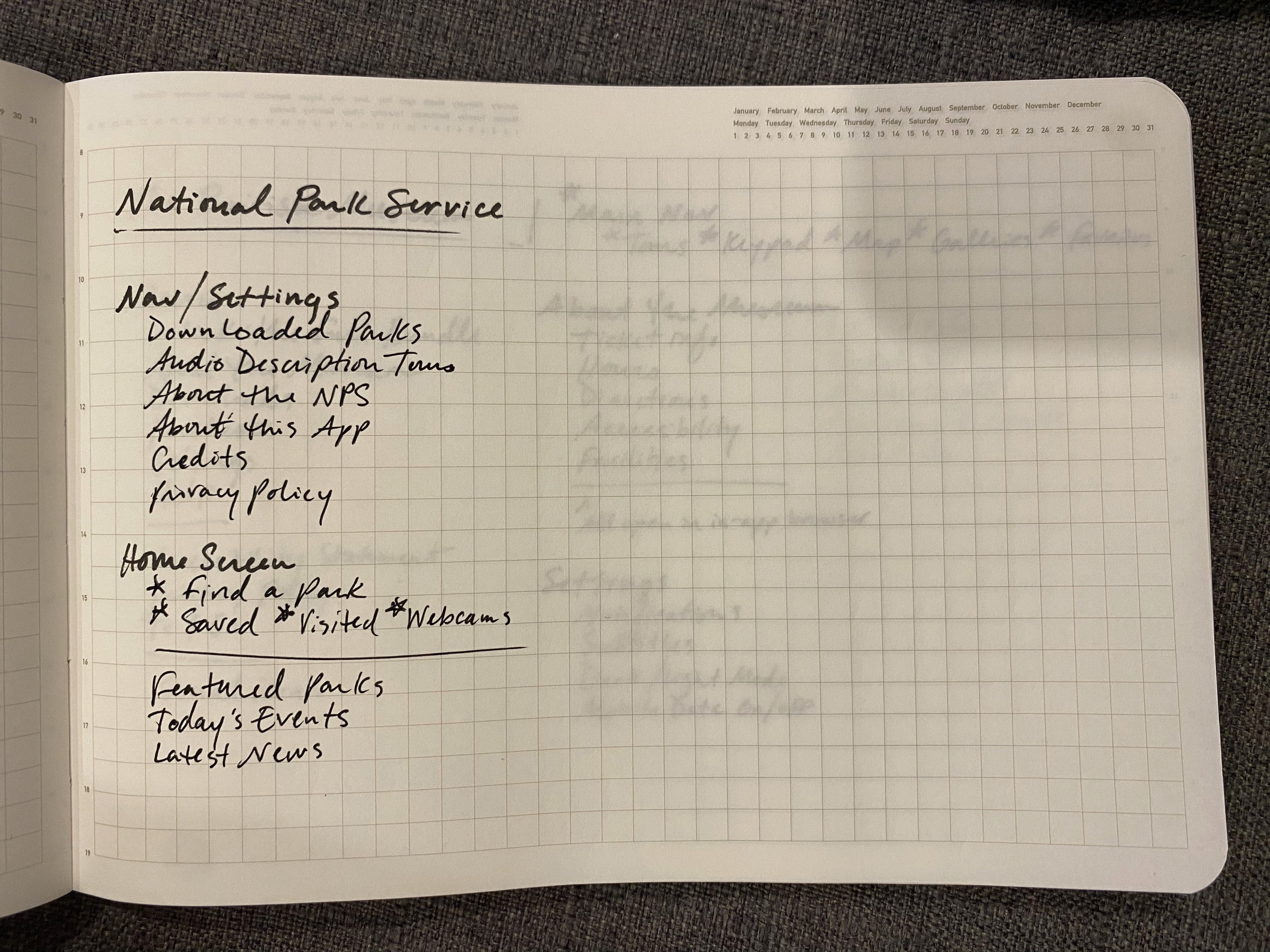
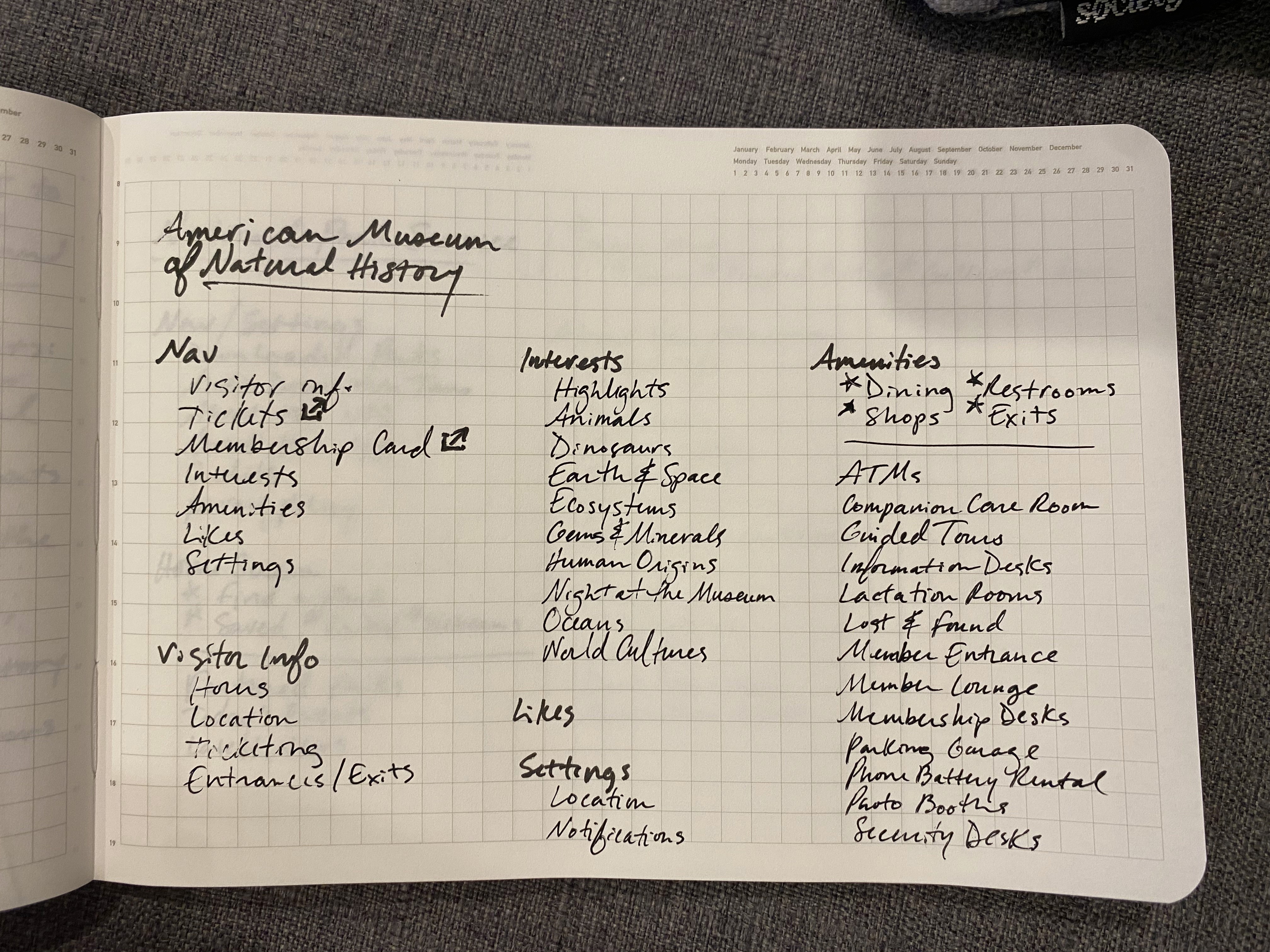
Competitive Analysis: After brainstorming several features that we felt would work within our goals, we analyzed digital products for the American Museum of Natural History, the National Parks Service, and the British Museum.

Investigating how they implemented some of the ideas that we had been considering helped to inform our information architecture and ensuing design.

Rnote 1
Rnote 1
Rnote 1
Rnote 2
Rnote 2
Rnote 2
Rnote3
Rnote3
Rnote3

Stage 3. Ideation

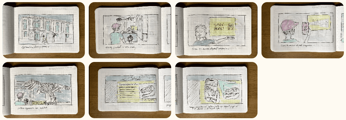
Storyboarding: We created a brief storyboard to visually describe how a visitor might connect to the mobile site and use Vuforia’s image recognition to pull up a 3D model to explore.

Stage 4. Wireframes & Sketches

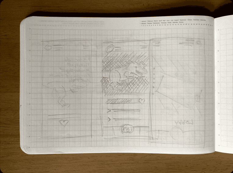
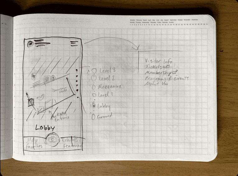
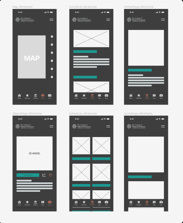
Wireframes & Sketches: Created detailed wireframes and sketches using Figma and hand-drawing to visualize user interactions.

Sketch1
Sketch1
Sketch1
Sketch 2
Sketch 2
Sketch 2

Stage 5. 3D Assets Creation

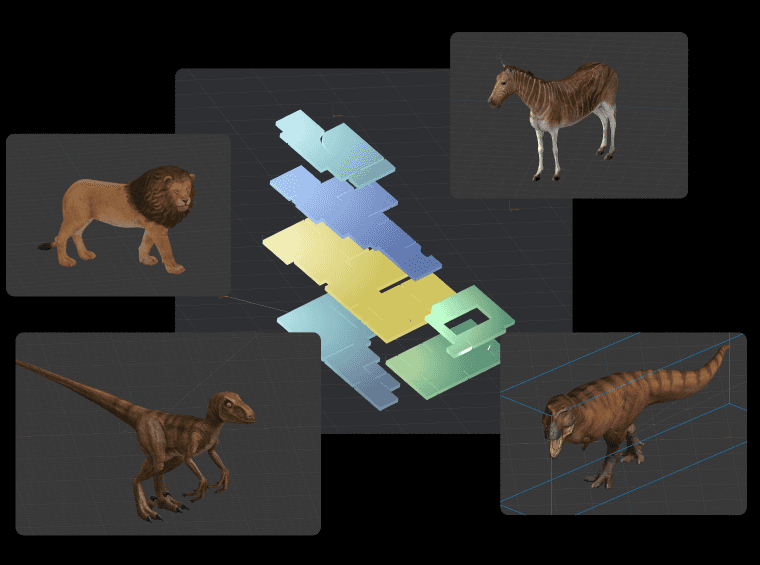
3D Asset Development: Designed high-fidelity 3D exhibit assets and created 3D maps for floors 1-4 using Spline, resulting in a 25% increase in retention rate, as indicated by Qualtrics survey responses from users who tried the prototype and viewed the storyboard.

Stage 5. 3D Assets Creation

3D Asset Development: Designed high-fidelity 3D exhibit assets and created 3D maps for floors 1-4 using Spline, resulting in a 25% increase in retention rate, as indicated by Qualtrics survey responses from users who tried the prototype and viewed the storyboard.

Stage 6. Prototype & Testing

Prototyping in Figma: Built full prototypes using Figma, incorporating feedback from initial testing phases to refine the design.

User Testing: Conducted usability testing sessions with 50+ users using Userberry, gathering qualitative and quantitative feedback to refine prototypes. Key insights included:

  • Increased Engagement: 85% of users found the interactive features engaging and informative.

  • User Satisfaction: 30% reduction in user-reported issues after iterative testing and improvements.

Stage 7. Final Solution

High-Fidelity Touch-Ups in Figma: In the final phase, used Figma to refine the visual design, ensuring the app was aesthetically pleasing and user-friendly. Focused on enhancing the overall user experience based on feedback from testing phases.

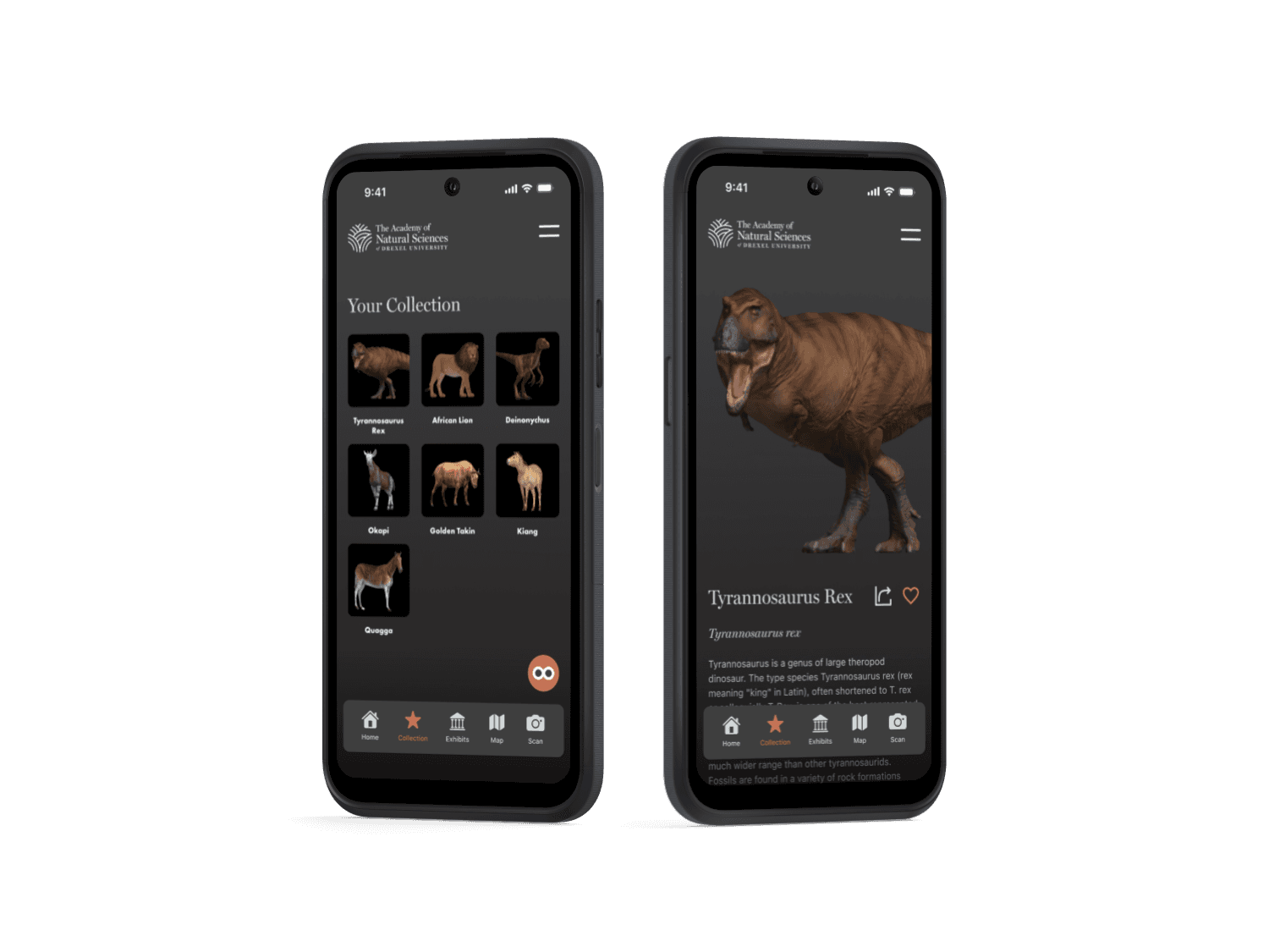
Solution Overview: The final Digital Companion Museum App provides a robust platform for enhancing visitor engagement through AI features and personalized, real-time information. Key functionalities include:

  • AI-Enhanced Interactions: Users can interact with exhibits through AI, providing dynamic and personalized content.

  • Real-Time Information: Personalized content provides in-depth information about exhibits, tailored to user preferences.

Stage 8. Outcome & Reflection

Learnings & Challenges: This project highlighted the importance of user-centered design and iterative testing. Key challenges included:

  • Balancing interactivity with usability: Ensuring the app was engaging without overwhelming users.

  • Refining the user interface: Continuously improving the design based on user feedback.

Impact:

  • Increased Visitor Engagement: 85% of users expressed a willingness to recommend the app to other museum visitors.

  • Enhanced User Satisfaction: 30% reduction in user-reported issues after iterative improvements.

Personal Growth: This project enhanced my skills in UX research, low-fidelity prototyping, and user testing. It reinforced the value of empathy in design and the importance of iterative refinement to create impactful user experiences.

Other projects

Copyright 2024 by Hai Le

Copyright 2024 by Hai Le

Copyright 2024 by Hai Le