Capstone: The Academy of Natural Science

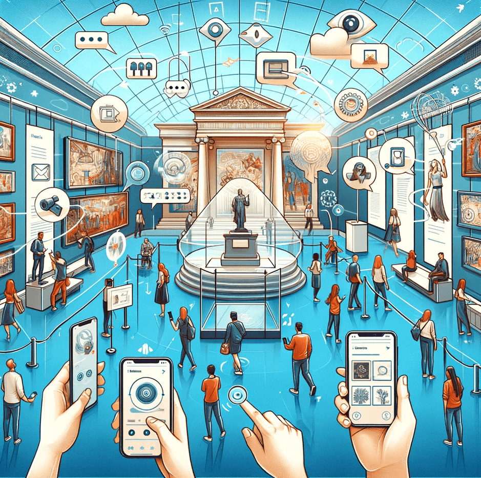
Explore the interactive app designed to revolutionize museum experiences by seamlessly integrating digital technology with exhibits, fostering enhanced engagement and immersive interactions for all visitors.

Role: UX Designer
Industry: Tourism Technology
Duration: 5 Months

Background

Recognizing the need for personalized and engaging interactions, this project aimed to create a digital companion that enhances visitor engagement through interactive maps, AI-driven recommendations, and seamless navigation throughout the museum.

Meeting with Board of Museum: After an initial competitive analysis of local museums, we had a conversation with Marina McDougall, Vice President of Experience and Engagement at the Academy of Natural Sciences of Philadelphia. We discussed the possibilities of using AR and/or AI to enhance the visitor experience with a digital companion.

The Idea

A digital companion for museum visitors, providing real-time guidance, personalized recommendations, and an enriched, interactive experience throughout their visit.

Potential Problem

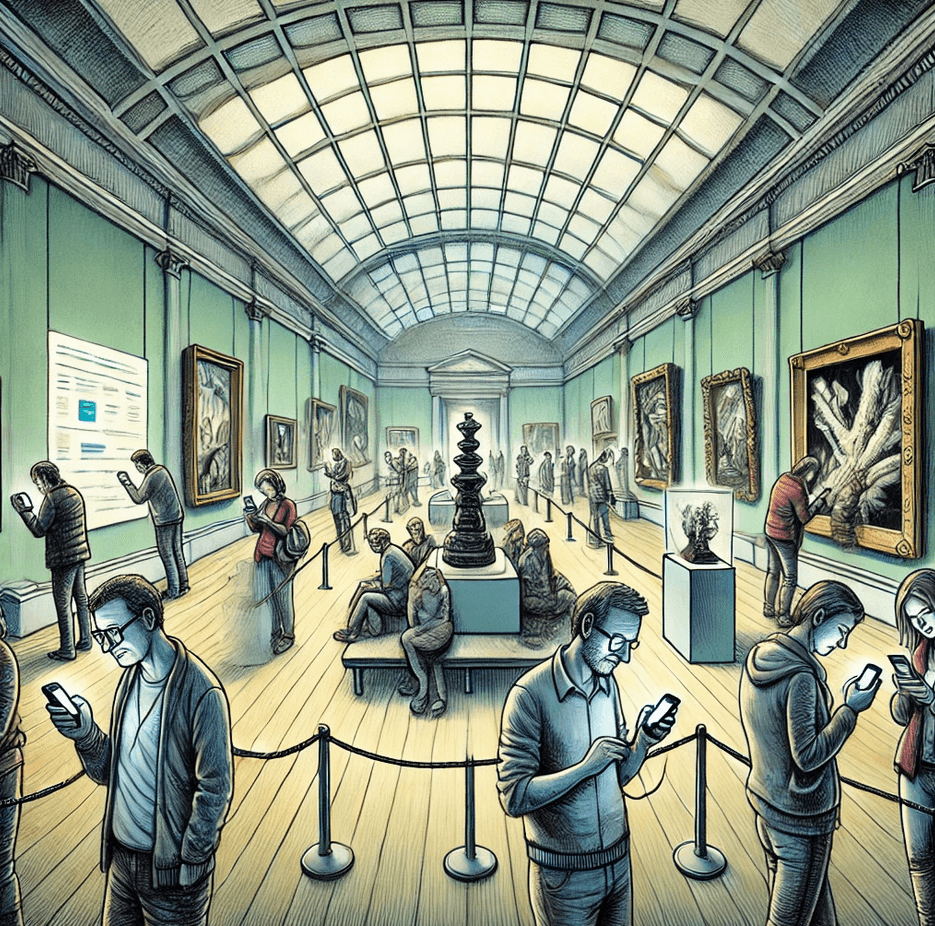
Encouraging visitors to use their phones at the museum would result in distraction and disengagement.

Research Findings

Literature Review: One of the major takeaways was that there are 5 generally agreed upon categories of museum visitors:
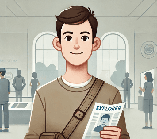
Explorers

Explorers

Explorers

Curiosity-driven with general interest in the content of the museum.

Facilitators

Facilitators

Facilitators

Socially motivated and focused on enabling the experience and learning of others.

Professional/Hobbyist

Professional/Hobbyist

Professional/Hobbyist

Feel a close tie between the museum & their personal interests or passions.
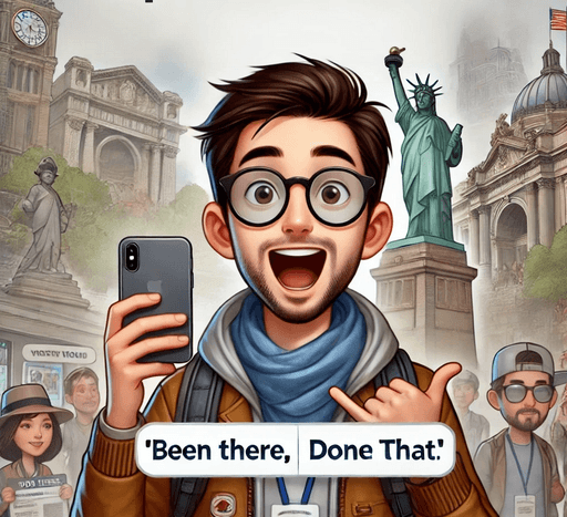
Experience Seekers

Experience Seekers

Experience Seekers

Want to be able to say they were there; “been there, done that”.
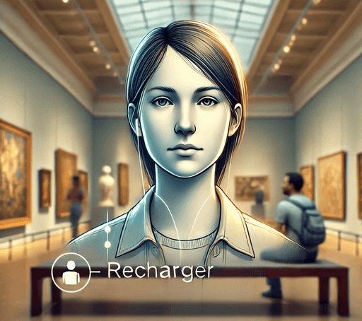
Rechargers

Rechargers

Rechargers

Seek a contemplative or restorative experience.

Competitive Analysis:
We Investigating how they implemented some of the ideas that we had been considering helped to inform our information architecture and ensuing design.
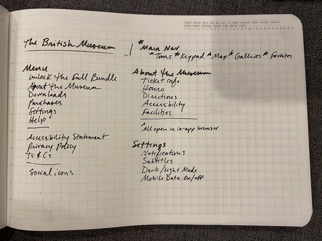
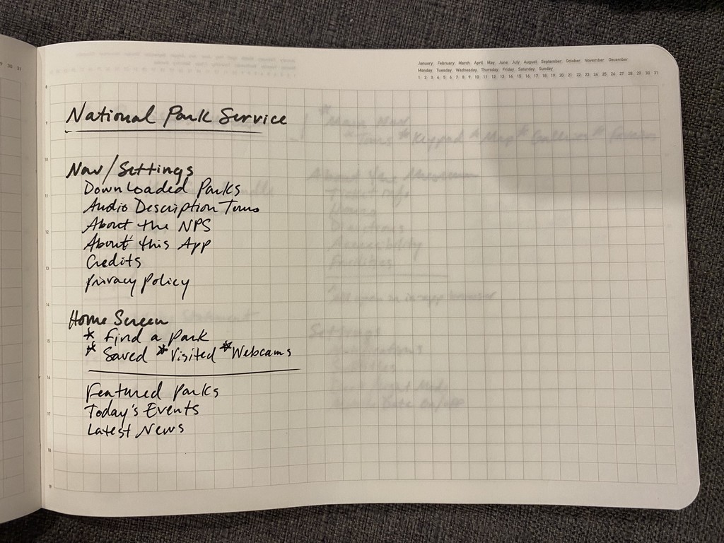
Insights: We successfully identified the top strengths of each museum app, allowing us to leverage these features to enhance the overall design of our Museum Digital Companion.

Top Strengths:

Interactive Floor Plans

Interactive Floor Plans

Interactive Floor Plans

A standout feature, allowing users to easily navigate the museum and locate exhibits, amenities, and events in real-time.

A standout feature, allowing users to easily navigate the museum and locate exhibits, amenities, and events in real-time.

A standout feature, allowing users to easily navigate the museum and locate exhibits, amenities, and events in real-time.

Virtual Tours and 3D Models

An exceptional feature, allowing users to explore the museum’s collections from anywhere in the world.

Personalize Recommendations

This feature enhances user engagement by suggesting exhibits and tours based on individual interests and previous interactions, creating a more tailored and enriching museum experience.

User Research

Methods:

Methods:

Methods:

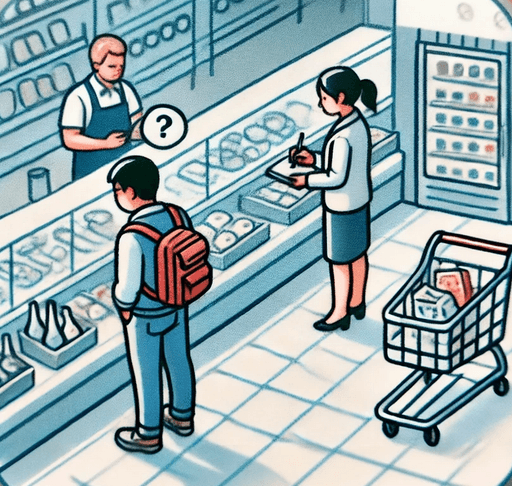
User Interview

Conducted semi-structured interviews with 10 museum visitors and focused on understanding their expectations, challenges, and preferences when exploring a museum.
Surveys

Distributed an online survey to 30 museum visitors to collect quantitative data on user preferences, behaviors, and satisfaction levels.

Contextual Inquiry

Conducted contextual inquiries with 5 participants, shadowing visitors during their museum visits to observe their interactions with existing tools and their navigation behaviors in real-time.
Results:

Results:

Results:

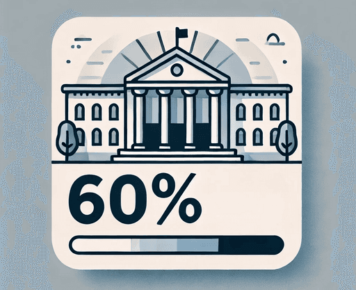
60% of users preferred using digital tools over traditional maps, highlighting the potential for a digital companion app to enhance their museum experience.
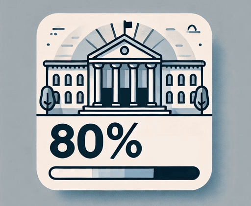
80% of users indicated that they would appreciate personalized recommendations for exhibits, as they often missed key attractions during their visits.

60% of participants expressed a desire for real-time updates on exhibit popularity and visitor flow to avoid overcrowded areas.

Key Insights:
High Demand for Personalized Recommendations
Preference for Digital Tools
Need for Real-Time Updates
Lack Interactivity between visitors and exhibits.

Key Insights:
High Demand for Personalized Recommendations
Preference for Digital Tools
Need for Real-Time Updates
Lack Interactivity between visitors and exhibits.

Key Insights:
High Demand for Personalized Recommendations
Preference for Digital Tools
Need for Real-Time Updates
Lack Interactivity between visitors and exhibits.

Ideation & Sketches:
Storyboarding

Ideation & Sketches:
Storyboarding

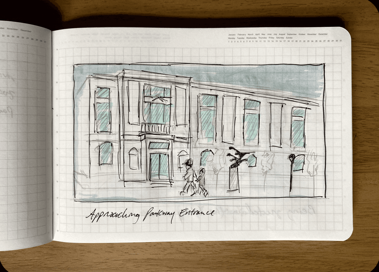
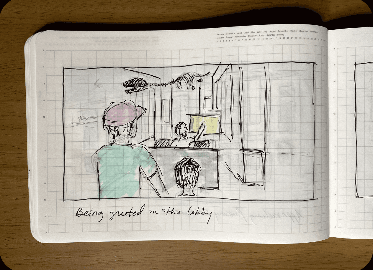
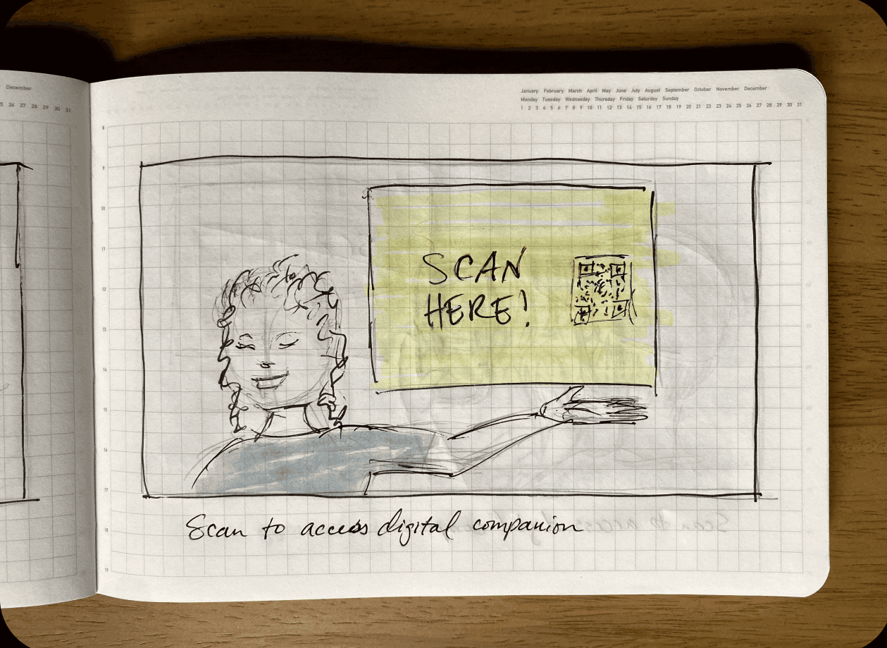
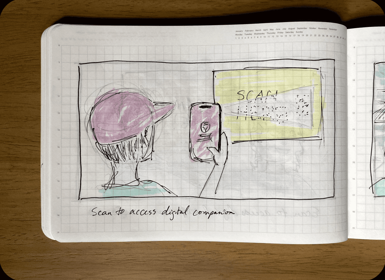
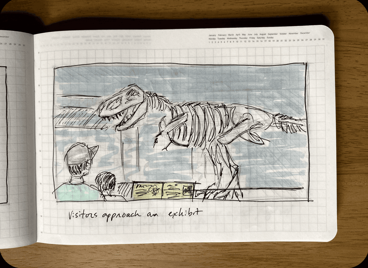
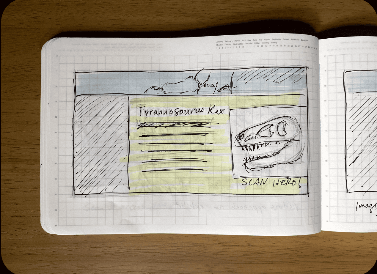
We created a brief storyboard to visually describe how a visitor might connect to the mobile site and use Vuforia’s image recognition to pull up a 3D model to explore.

We created a brief storyboard to visually describe how a visitor might connect to the mobile site and use Vuforia’s image recognition to pull up a 3D model to explore.

Wireframing & Low-fidelity Designs

3D Asset Creation
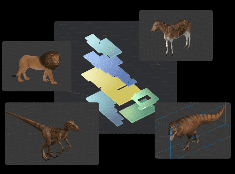
Designed high-fidelity 3D exhibit assets and created 3D maps for floors 1-4 using Spline.
Resulting in a 25% increase in retention rate, as indicated by Qualtrics survey responses from users who tried the prototype and viewed the storyboard.

Designed high-fidelity 3D exhibit assets and created 3D maps for floors 1-4 using Spline.
Resulting in a 25% increase in retention rate, as indicated by Qualtrics survey responses from users who tried the prototype and viewed the storyboard.

Designed high-fidelity 3D exhibit assets and created 3D maps for floors 1-4 using Spline.
Resulting in a 25% increase in retention rate, as indicated by Qualtrics survey responses from users who tried the prototype and viewed the storyboard.

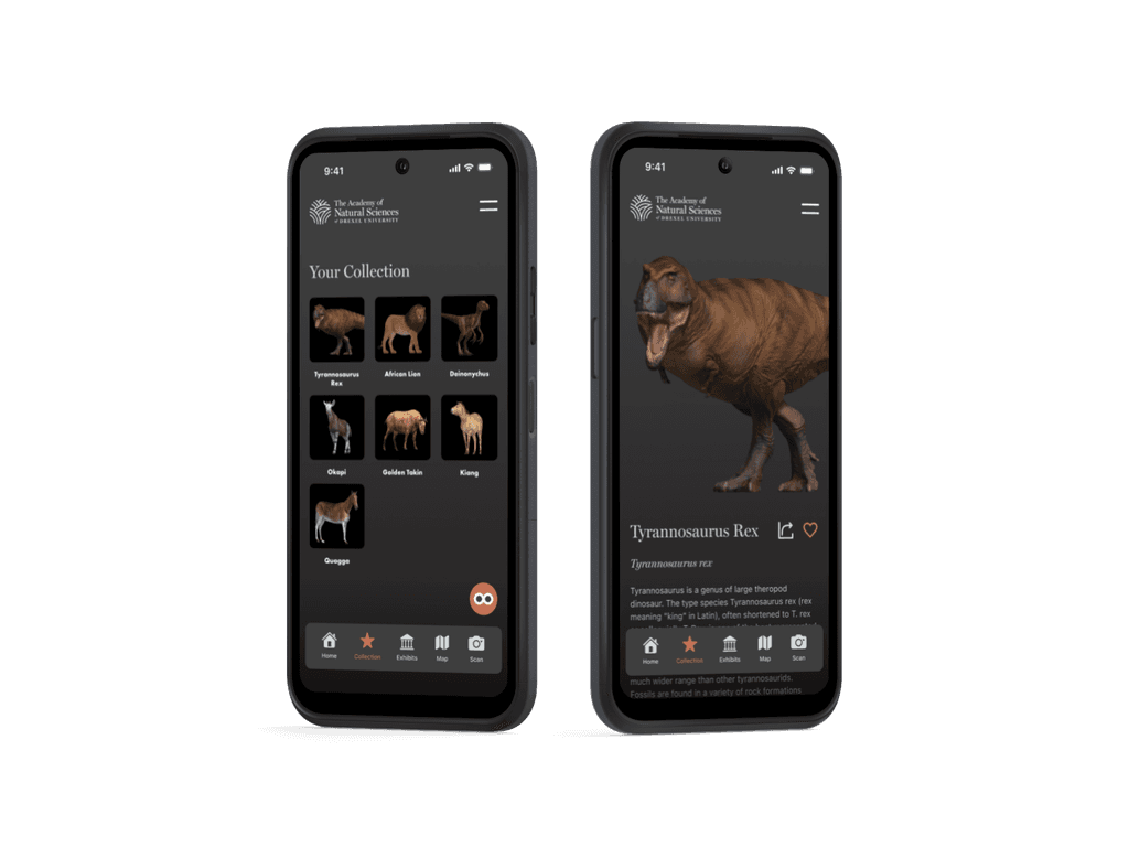
Creating Map and Exhibit Models in 3D using Spline to increase the interaction between user and exhibits.
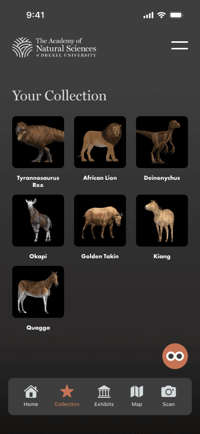
User can also saved the 3D models in their collection after visiting the museum.

Research indicating that souvenirs or keepsakes from a visit can enhance memory retention and increase engagement, particularly in the context of cultural and educational experiences like museum visits.
Prototyping & Testing

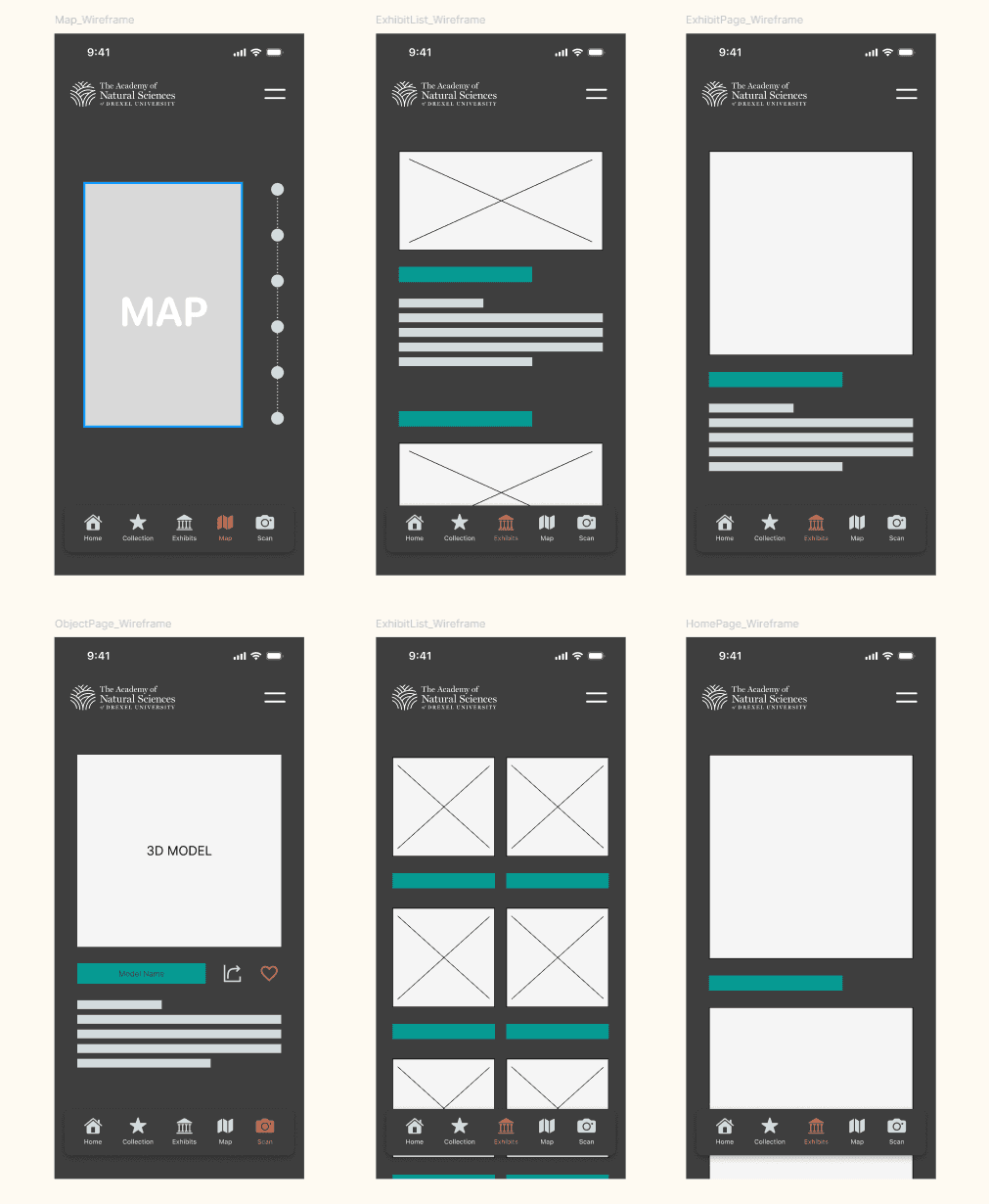
Overview: This section showcases the essential screens of the Figma prototype, highlighting the core pages and interactions within the app.

Recommendation

Give recommendation based on User's type.

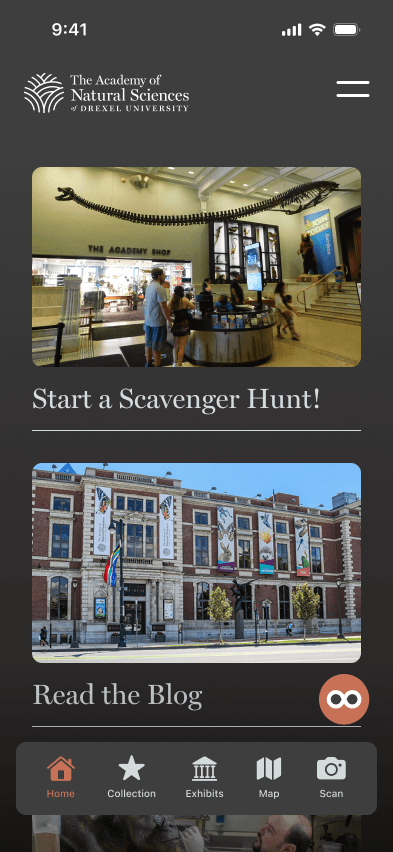
Home Page

Landing point

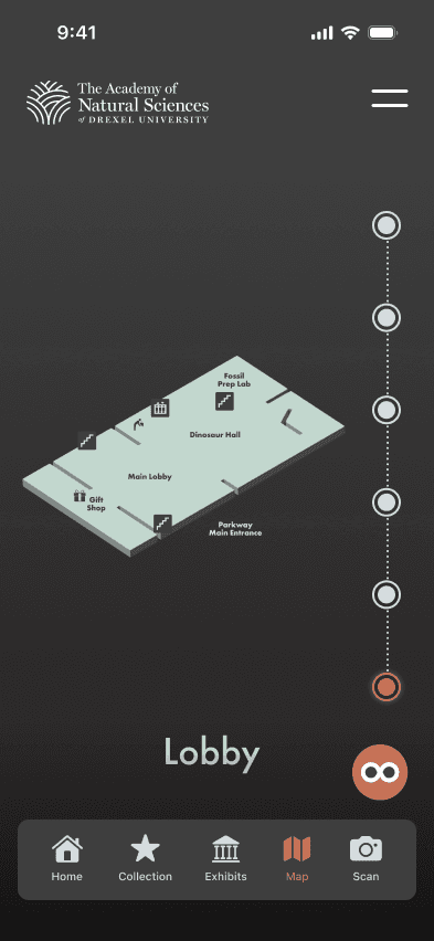
Map

Map & Location in 3D

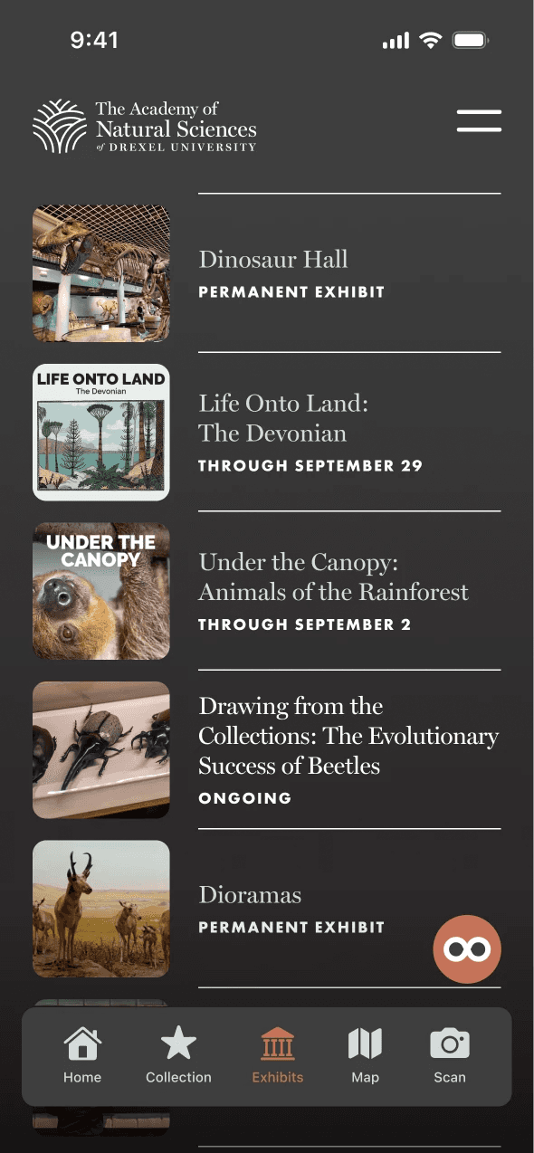
Exhibits Information

A list of Museum's Exhibits

Museum Blog

Blog and stories about the museum

Collection

Saved 3D collections for Users

Insight & Feedback: Conducted usability testing sessions with 30+ users using Userberry, gathering qualitative and quantitative feedback to refine prototypes.
Key insights included:

Insight & Feedback: Conducted usability testing sessions with 50+ users using Userberry, gathering qualitative and quantitative feedback to refine prototypes.
Key insights included:

Increased Engagement

85% of users found the interactive features engaging and informative.

User Satisfaction

30% reduction in user-reported issues after iterative testing and improvements.

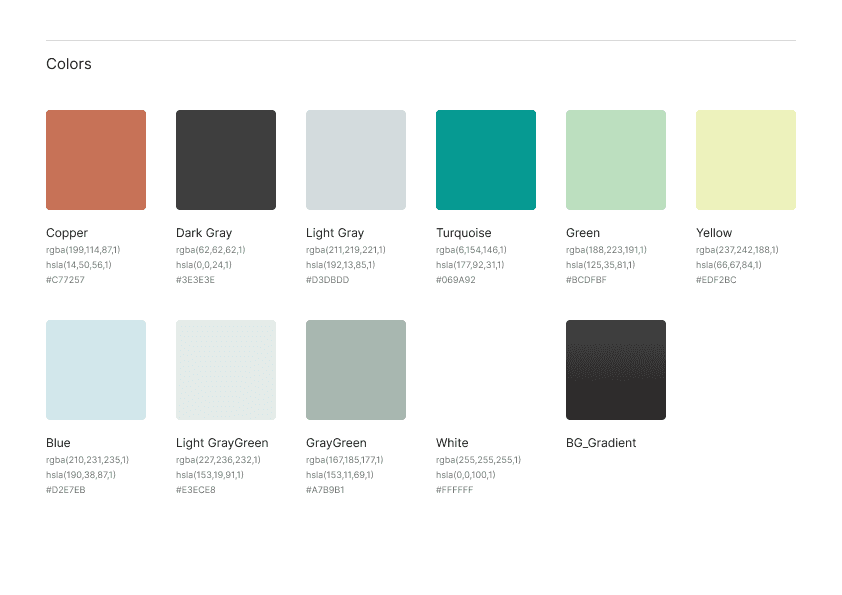
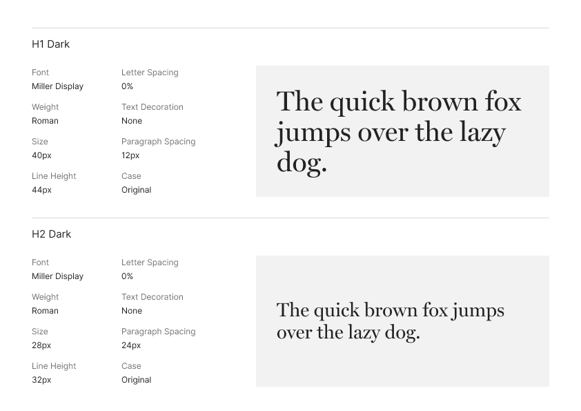
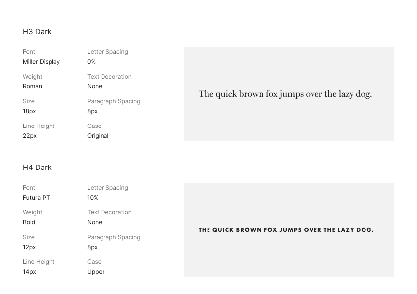
STYLE GUIDE

Design Material

Final Design

Solution Overview: The final Digital Companion Museum App provides a robust platform for enhancing visitor engagement through AI features and personalized, real-time information. Key functionalities include:

  • AI-Enhanced Interactions: Users can interact with exhibits through AI, providing dynamic and personalized content.

  • Real-Time Information: Personalized content provides in-depth information about exhibits, tailored to user preferences.

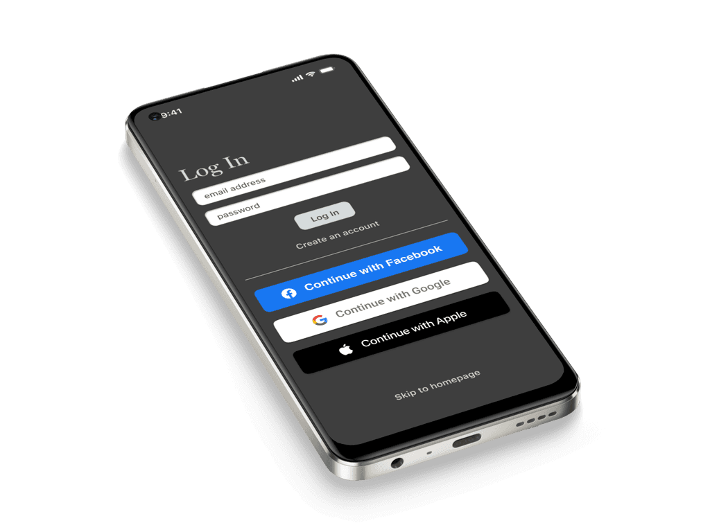
Sign Up
User Profile
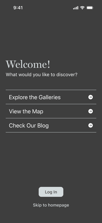
Explore the Gallaries

Explore the Gallaries

You can explore the galleries immediately and learn more about the exhibits before navigate to the spot.

Capture the Exhibit!

Capture the Exhibit!

You can scan the exhibits in the museum to save it into your collection and view it later.

Check out your location!

Check out your location!

Navigate to map to see where you are currently and what exhibits is in that level.

AI Interaction

AI Interaction

The AI bot enhances the visitor experience by pinpointing their location on an interactive map and offering personalized recommendations for popular and must-see exhibits.
More exhibits can be saved to collection

Outcome & Reflection

Outcome & Reflection

Learnings & Challenges: This project highlighted the importance of user-centered design and iterative testing. Key challenges included:

  • Balancing interactivity with usability: Ensuring the app was engaging without overwhelming users.

  • Refining the user interface: Continuously improving the design based on user feedback.

Impact:

  • Increased Visitor Engagement: 85% of users expressed a willingness to recommend the app to other museum visitors.

  • Enhanced User Satisfaction: 30% reduction in user-reported issues after iterative improvements.

Personal Growth: This project enhanced my skills in UX research, low-fidelity prototyping, and user testing. It reinforced the value of empathy in design and the importance of iterative refinement to create impactful user experiences.
Come and play around! Link to → Figma

Copyright 2024 by Hai Le

Copyright 2024 by Hai Le

Copyright 2024 by Hai Le

Getting

Getting

capstone

capstone

project!

project!

Getting

Getting

capstone!

capstone!

Capstone!

Capstone!